
— British Gas app.
- Lead designer for the British Gas app, leading two designers.
- One app for customers who pay by bill and customers who top up.
- A design system with accessibility and dark mode from the start.
- Client

The short version
A 30-second read
The problem
British Gas customers who pay by bill and those who pay as they go need different things from the app. Both need to see where they stand at a glance, especially when money is tight.
What I did
As lead designer for the app, leading two designers: the structure for both kinds of customer, every state of the home screen, and a full design system with tokens, dark mode and accessibility built in.
What changed
The App Store rating rose from 2.1 to 4.5 stars (4.1 on Google Play) for nearly 2 million customers, with faster loading, a full design system and dark mode.
- 4.5App Store stars, up from 2.1
- 40+documented components
- 2designers in my team
01/ Summary
- — Services
- Design leadership
- Mobile app design
- Information architecture
- Design system
- Accessibility
- Design to development handover
- — Deliverables
- The app's structure for two kinds of customer
- Master designs for every journey and state
- Light and dark themes, down to 320 pixels
- A design system of 40+ documented components
- Design tokens shared with engineering
- An accessibility approach and standards
- — Outcomes
- App Store rating up from 2.1 to 4.5 stars, improving quickly after launch, and 4.1 on Google Play, for nearly 2 million customers
- Faster loading, from reworked code and performance work, with skeleton screens so nothing jumps
- A full design system, 40+ documented components with tokens shared with engineering
- Dark mode, with every screen designed in light and dark
- One app, two experiences: for customers who pay by bill and customers who top up
- Every state designed, from loading and errors to emergency credit, in light and dark
- Accessibility built in, against WCAG 2.1 AA, with an independent audit
02/ Understanding the problem
- ~2mcustomers using the app
- 100+screens to redesign
- 40+components to design and document
Paying by bill
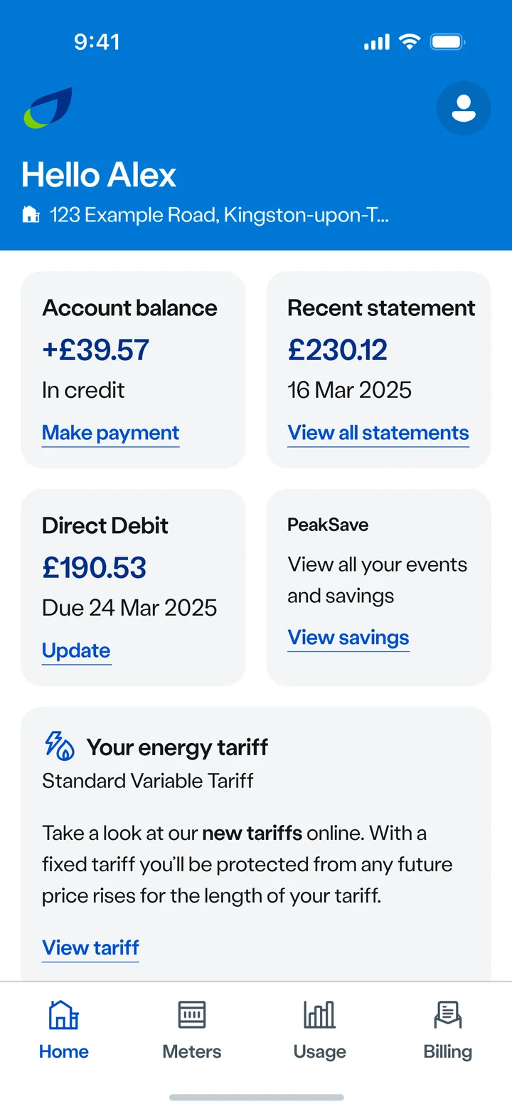
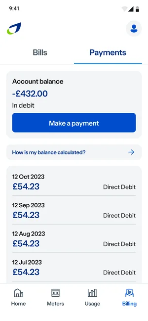
Most customers get a bill and pay by Direct Debit. They want to know their balance, check a bill, update a payment and send a meter reading, then get on with their day.
Paying as you go
Prepayment customers top up before they use energy. If credit runs out, the heating goes off. What they need first is how much credit is left, and how to top up.
100+ screens, redesigned.
79%
of 16,000 App Store ratings are five stars.
British Gas app, App Store (UK), November 2026.
- 5 stars79%
- 4 stars9%
- 3 stars2%
- 2 stars1%
- 1 star8%
03/ Two apps in one
Dashboard
Balance, latest bill and Direct Debit, at a glance.
Bills and statements
Every bill and statement, with a PDF viewer in the app.
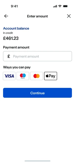
Make a payment
Pay a balance by card, or with a saved payment method.
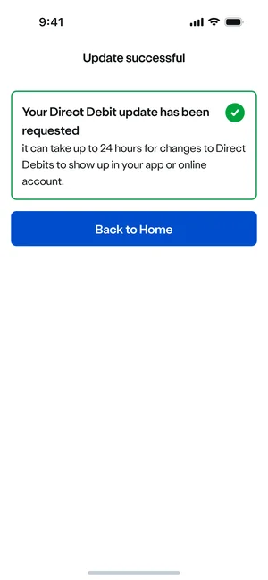
Direct Debit
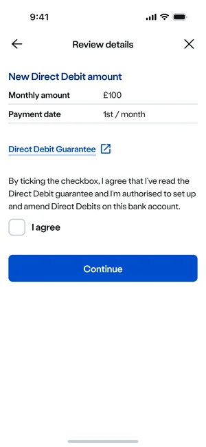
Set one up, update it, and see when a review will change it.
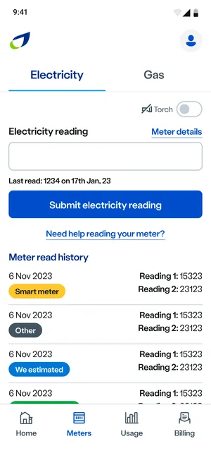
Meter readings
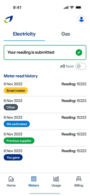
Submit a reading, with help for each kind of meter.
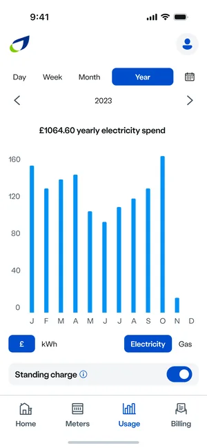
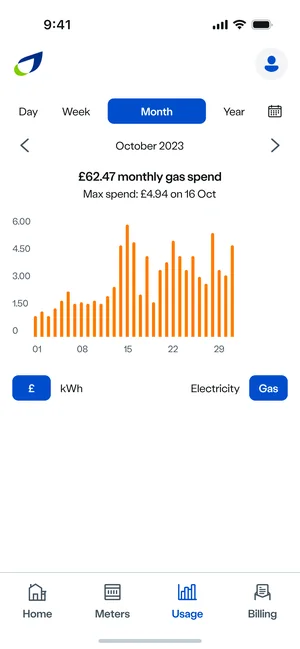
Usage
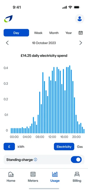
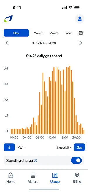
How much energy was used, and when, for smart meters.
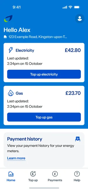
Home
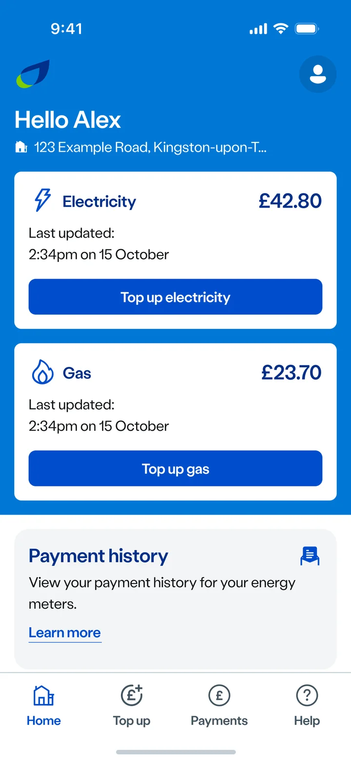
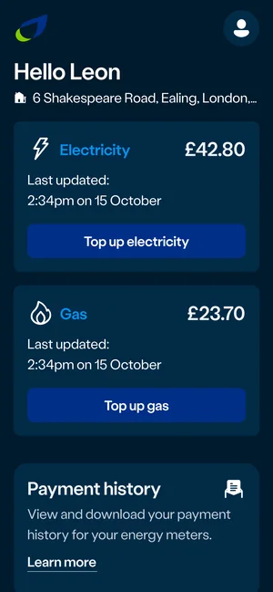
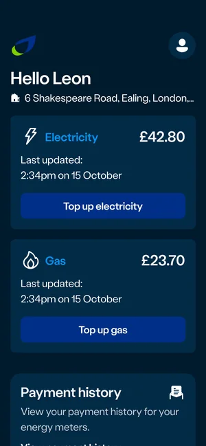
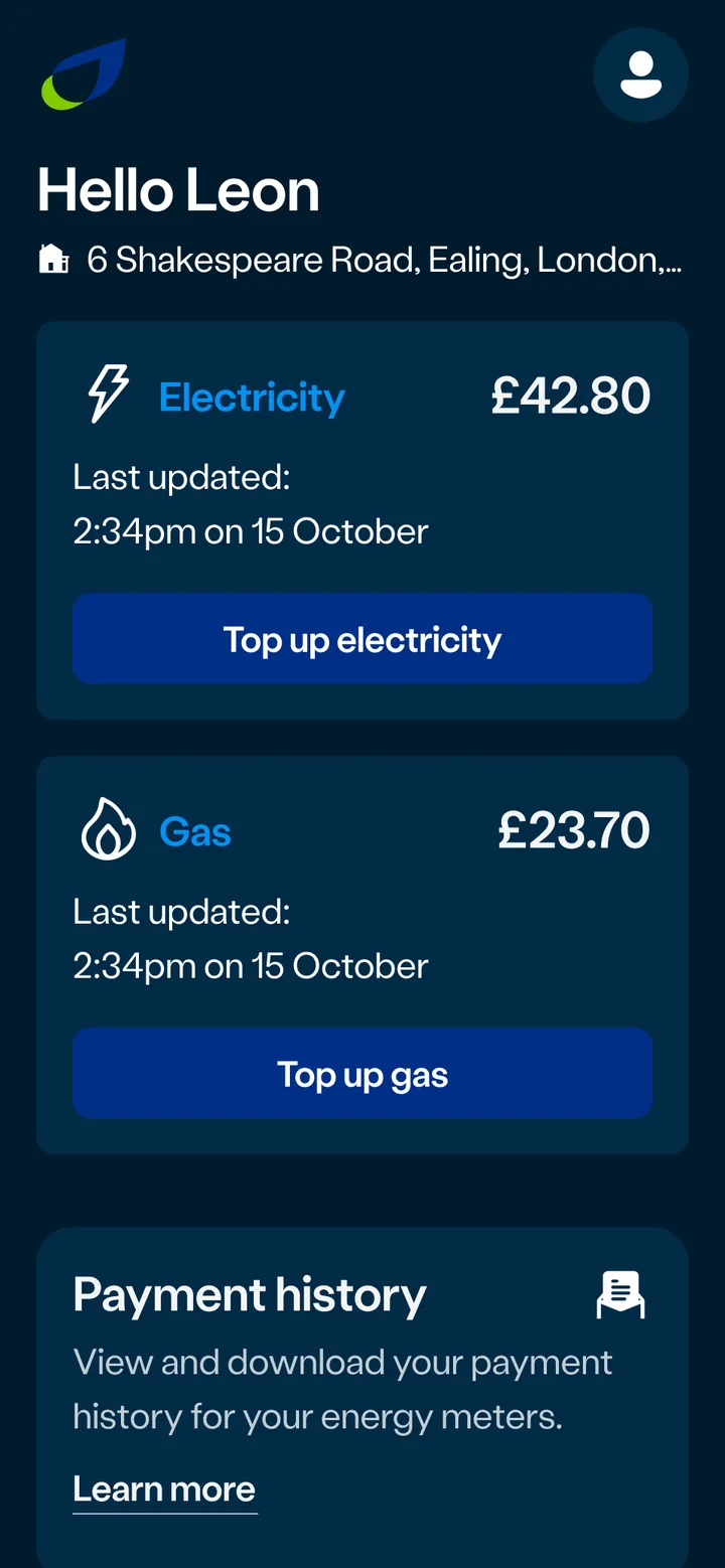
Credit left for electricity and gas, and when each was last updated.
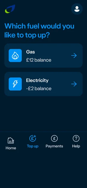
Top up
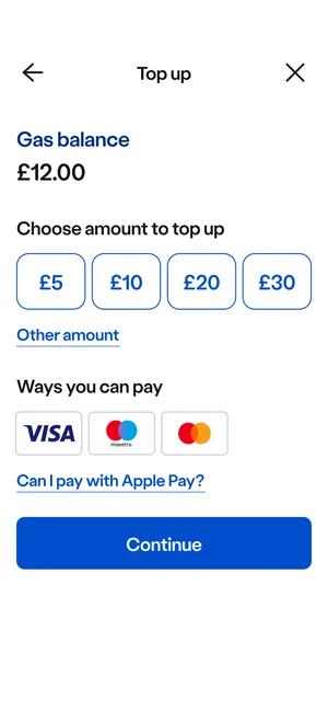
Top up either fuel straight from the home screen.
Smart cards
For customers with a traditional prepayment meter and a card or key.
Payments
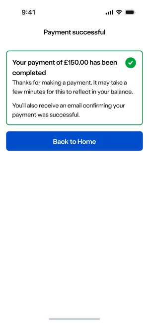
Every top-up, with the payment history in one place.
Notifications
Messages about credit and top-ups, as they happen.
Help
Help paying for energy, and ways to use less, always one tap away.
04/ Every journey, screen by screen
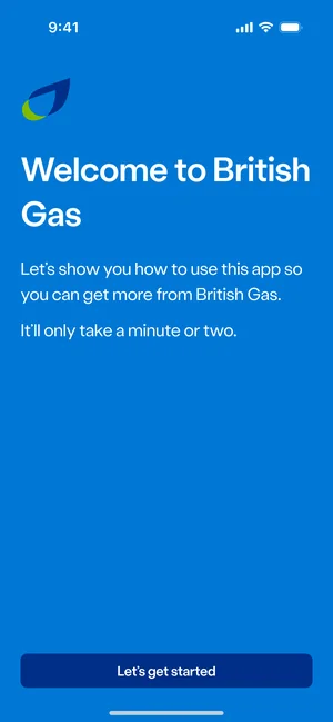
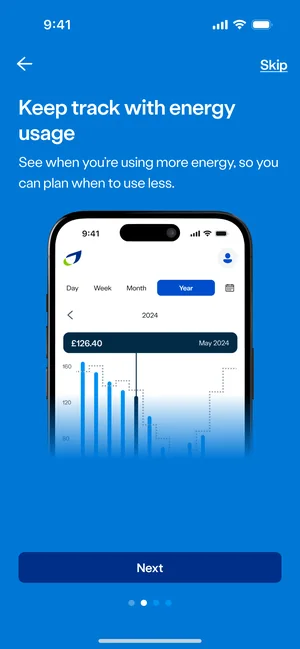
From opening the app to the dashboard: what the app does, in the customer's words, then straight to their account.
- 01
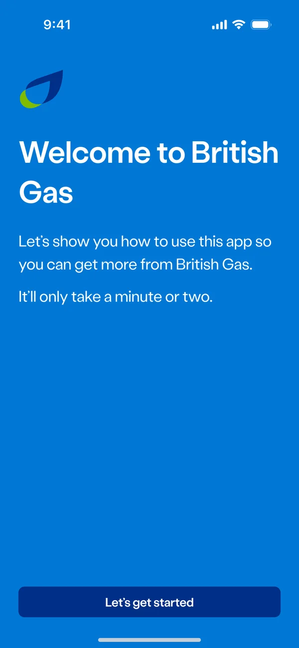
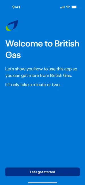
WelcomeWhat the app is for, and that it only takes a minute.
- 02
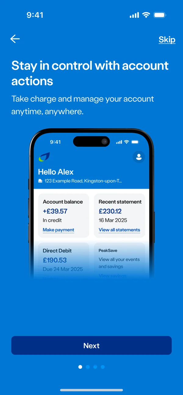
Stay in controlManage the account any time, anywhere.
- 03
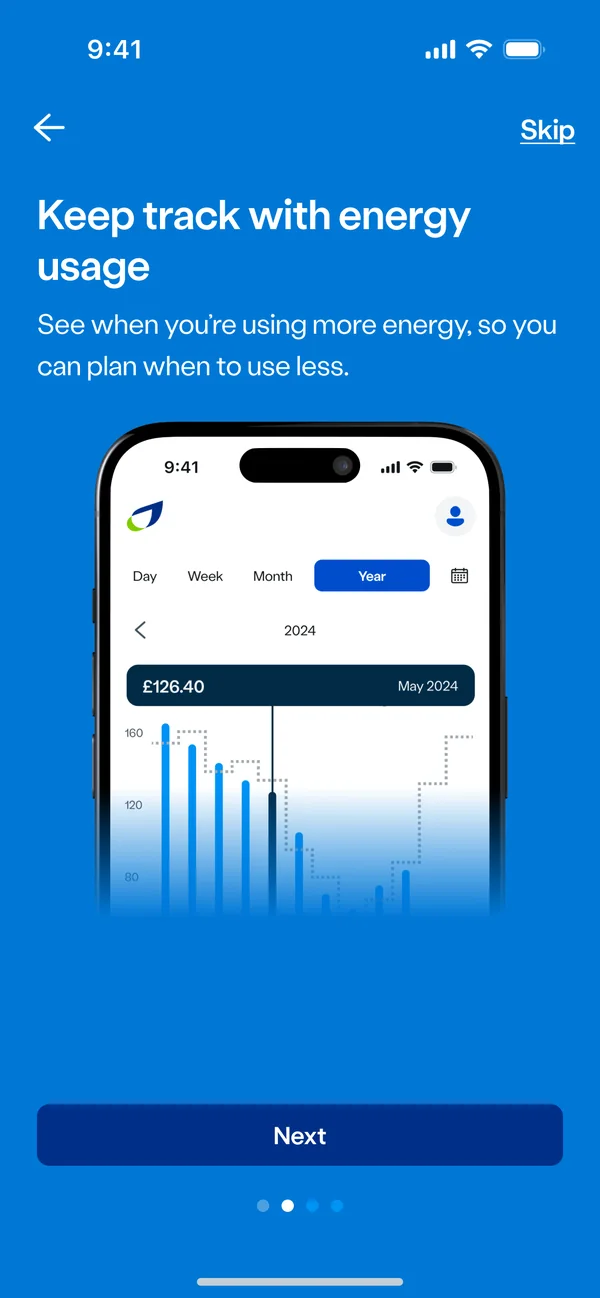
Keep track of energySee when you use more, so you can use less.
- 04
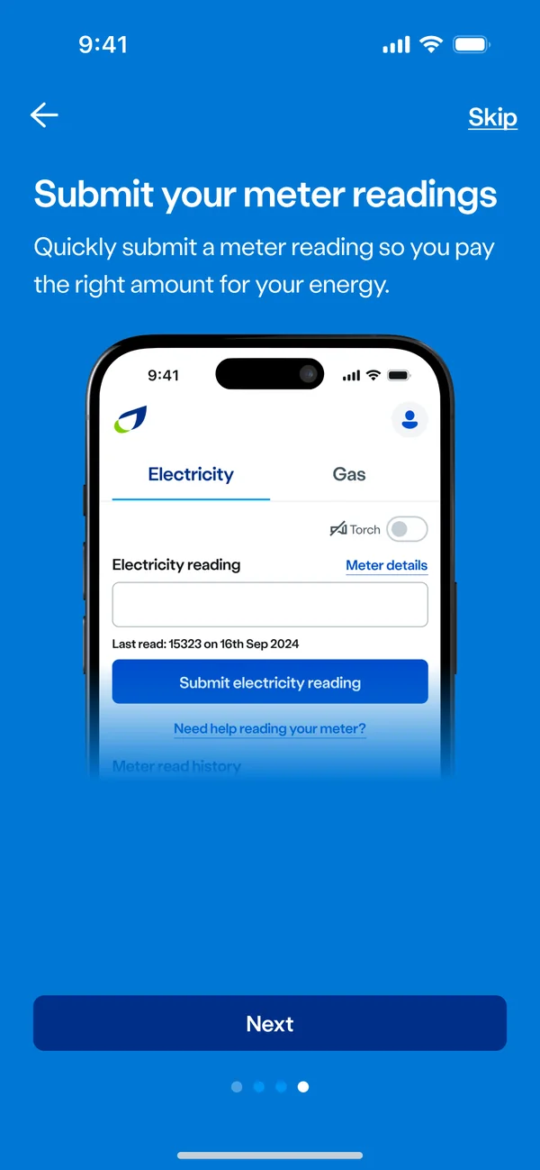
Submit meter readingsQuick readings mean the right amount on the bill.
- 05
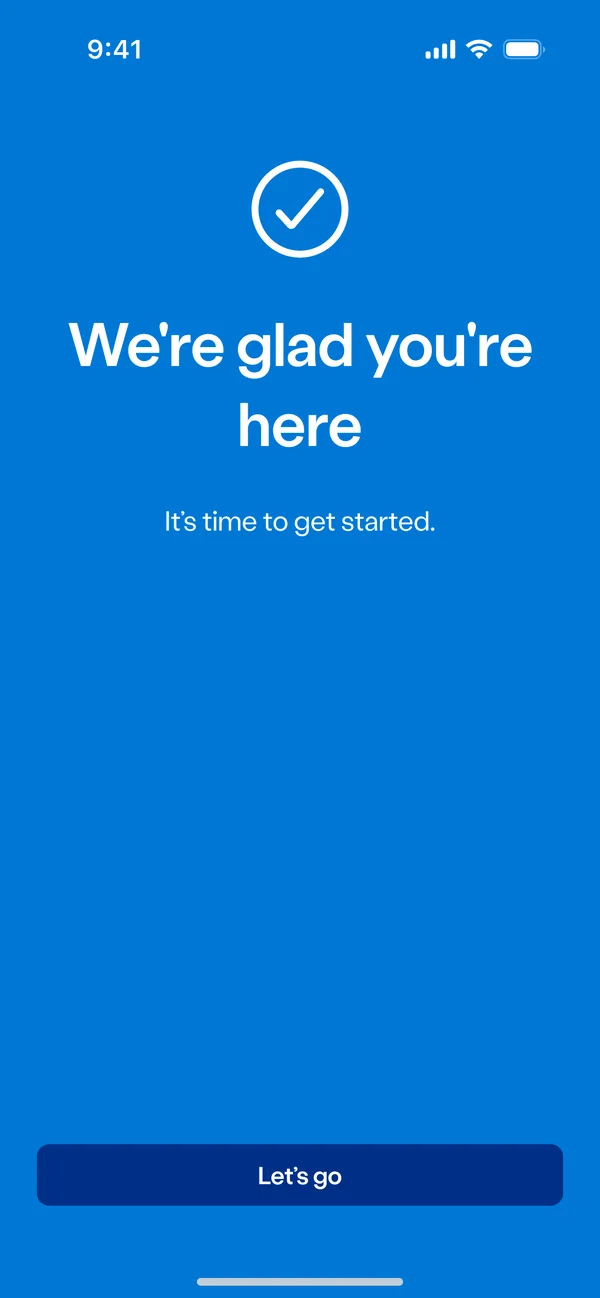
ReadyA clear end to onboarding.
- 06
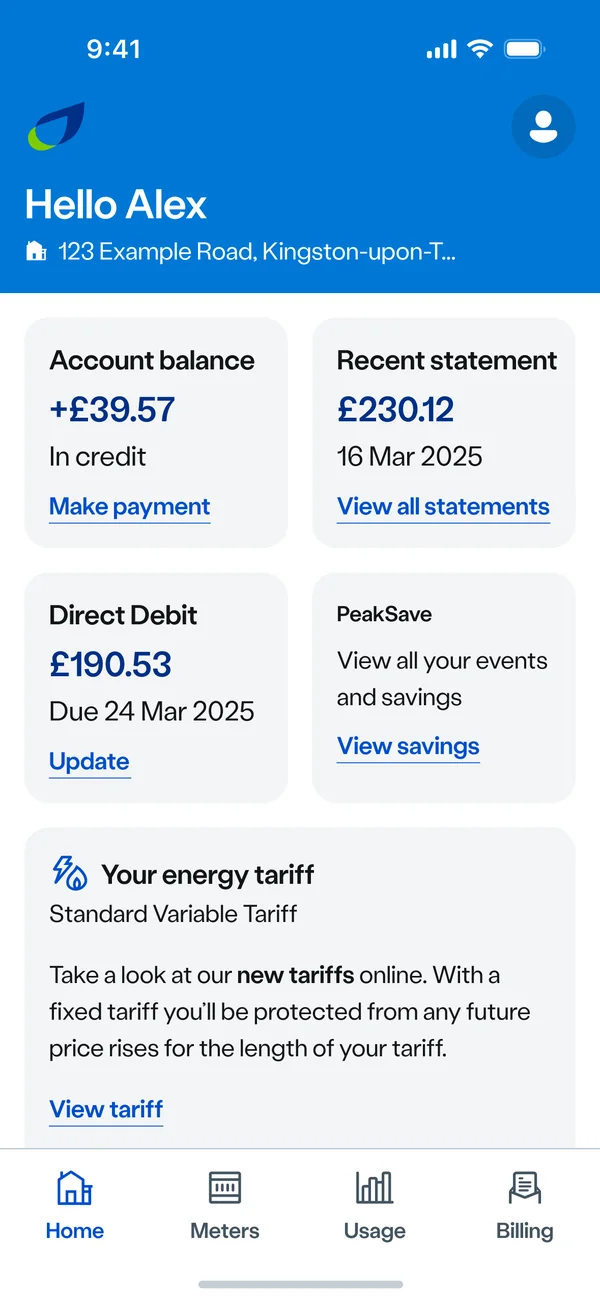
The dashboardBalance, latest statement, Direct Debit and tariff, at a glance.
05/ Designing every state
- Everything is fine. Credit for both fuels, when each was last updated, and a top-up button for each.
- Top-up due. A badge on the fuel that's running low, before it becomes urgent.
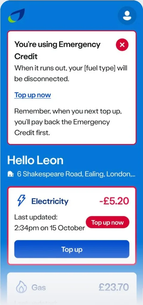
- Emergency credit. Plain words at the top: what's happening, what happens when it runs out, and how to top up.
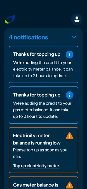
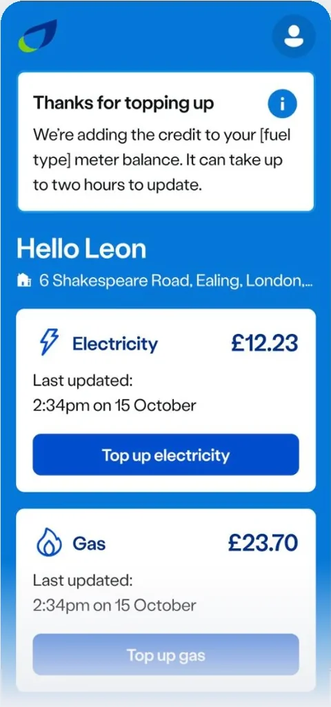
- Payment processing. Thanks for topping up, and an honest wait: it can take up to two hours to reach the meter.
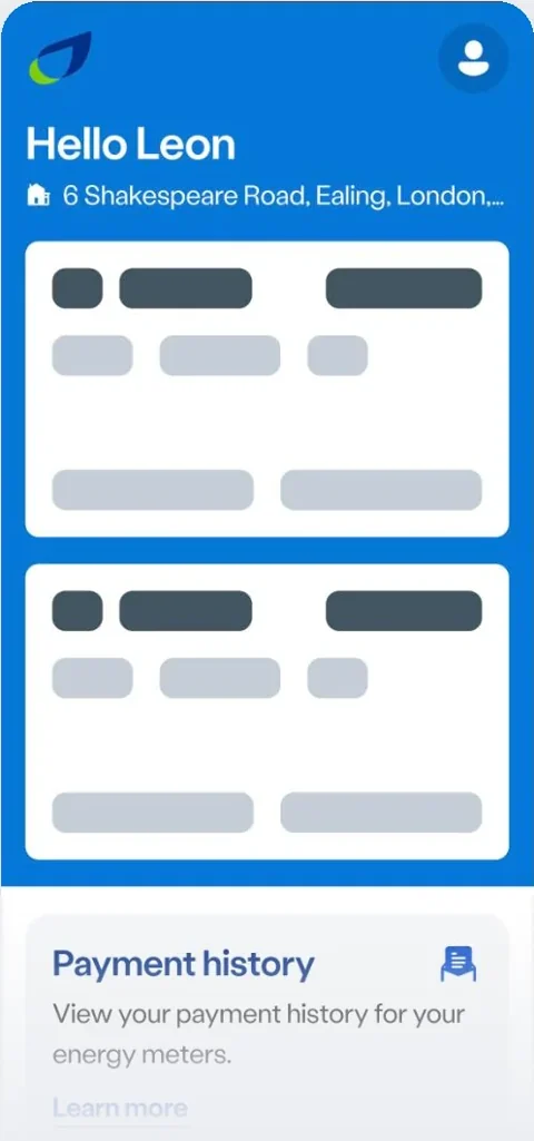
- Loading. Skeleton cards that hold the layout, so nothing jumps when the numbers arrive.
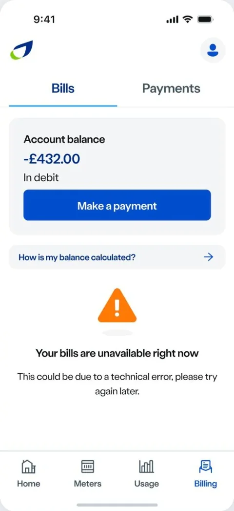
- Something went wrong. A clear message in place of the content that's missing, and the rest of the screen still working.
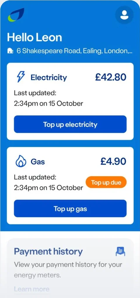
06/ The prepayment home screen
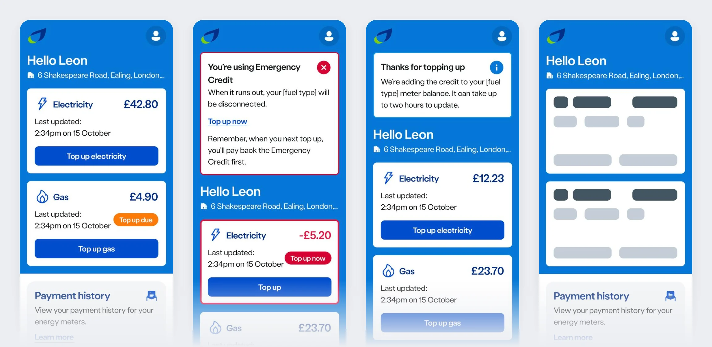
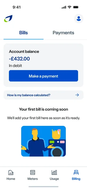
Top-up due, emergency credit, payment processing and loading. Each one tells the customer where they stand, and what to do next.
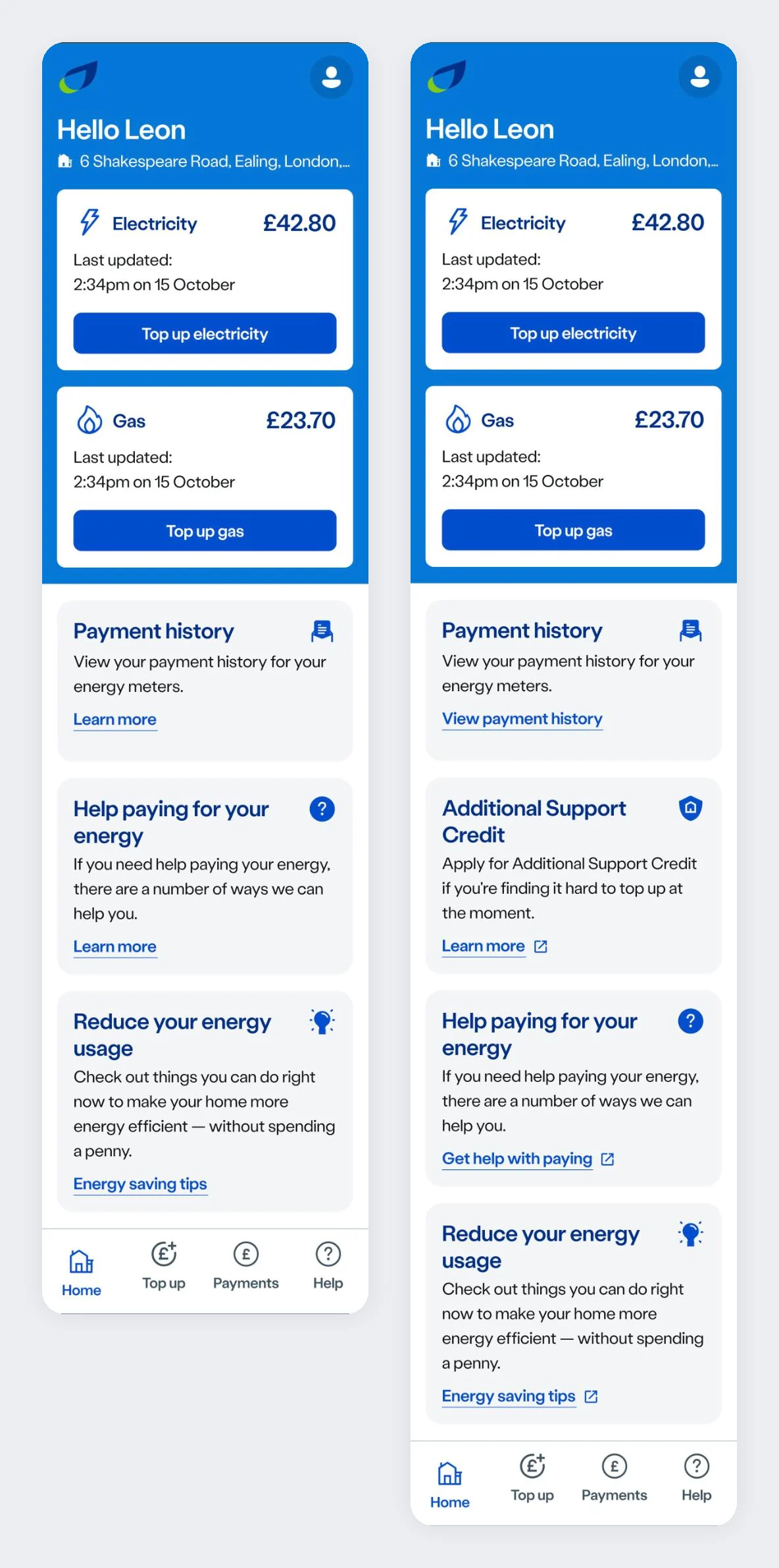
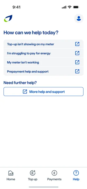
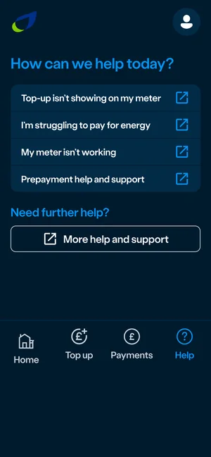
Current and proposed: support moved up to the home screen, and links that say where they go. 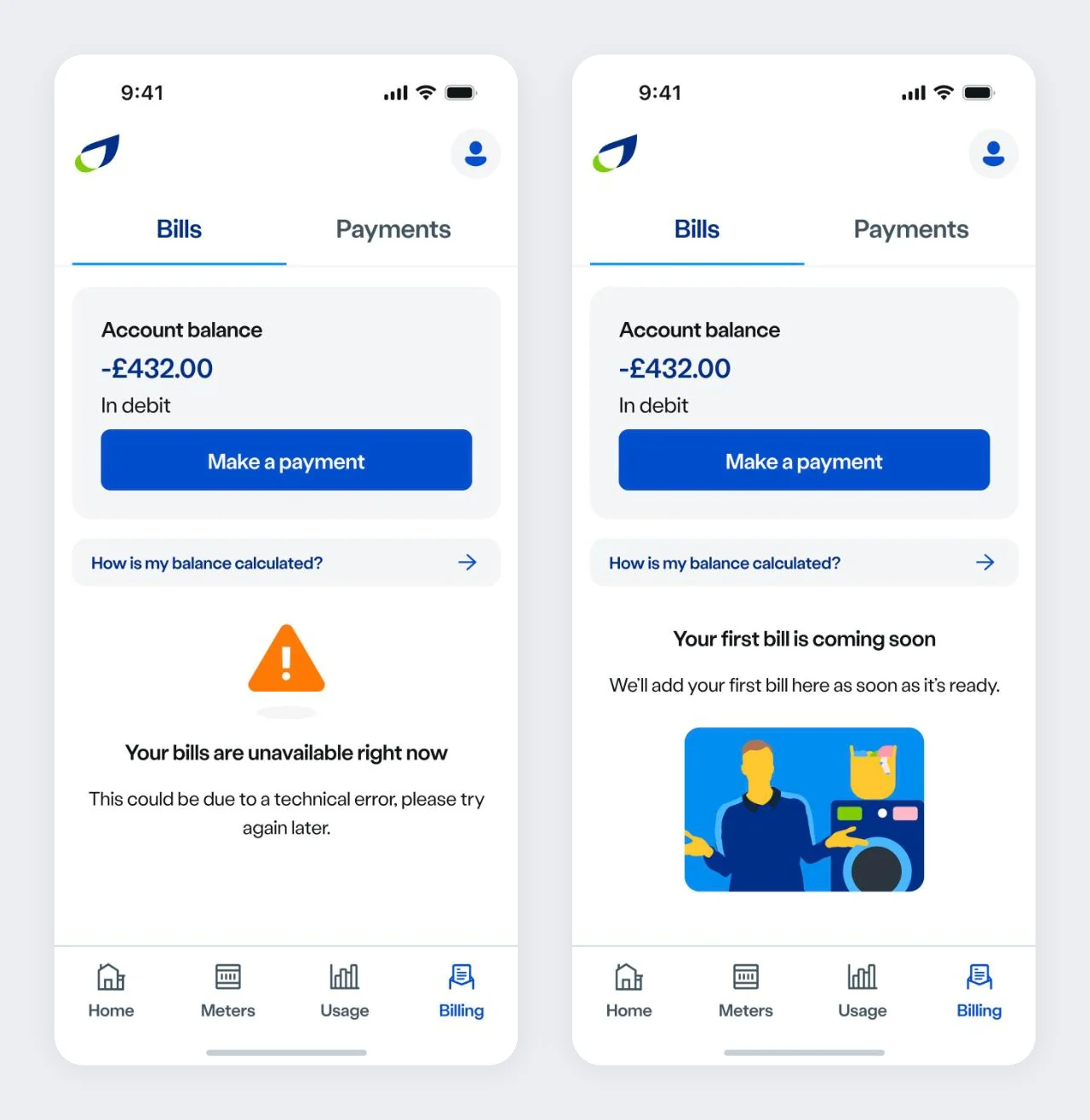
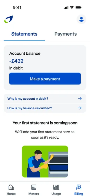
The same care on the bill-paying side: an error that still shows the balance and the way to pay, and a friendly empty state before the first bill.
07/ From current to proposed
Support, sooner
For customers finding it hard to top up, at the moment they need it.
FromHelp with paying, two levels downToAdditional Support Credit on the home screenLinks that say where they go
Clearer for everyone, and for screen reader users listing the links on a screen.
From“Learn more”, twice on one screenTo“View payment history”, “Get help with paying”Leaving the app, signposted
So nobody is surprised to find themselves in a browser.
FromLinks that quietly opened a websiteToAn external link icon on every link that leaves the app
08/ Light and dark, down to 320 pixels
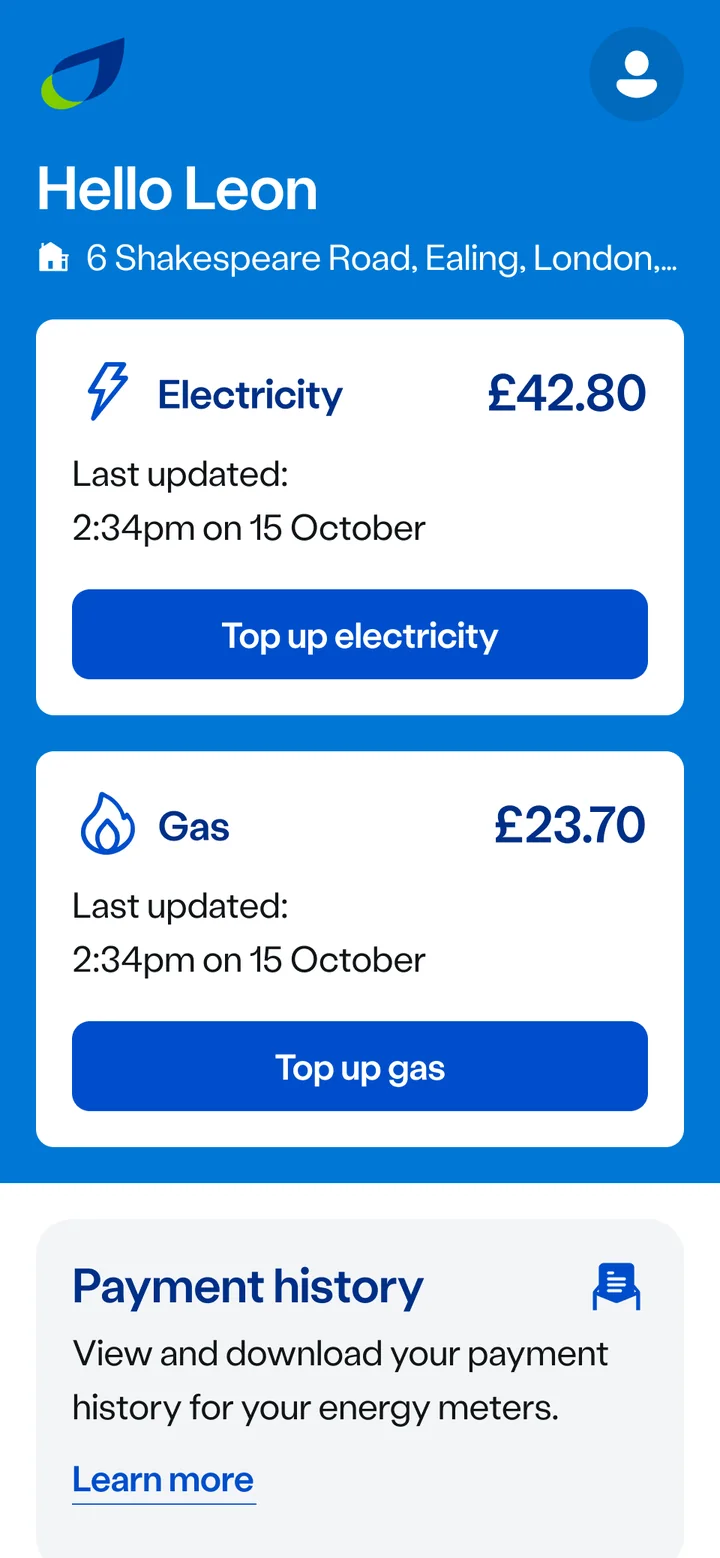
Drag across the screen
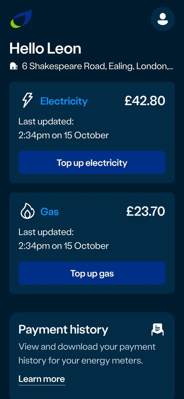
The same prepayment home screen, in light and dark. Both themes come from the same design tokens, so a change in one place reaches every screen, in both.
09/ A design system for the app
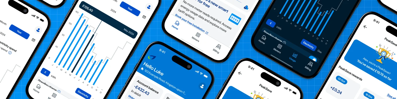
Real components, straight from the library
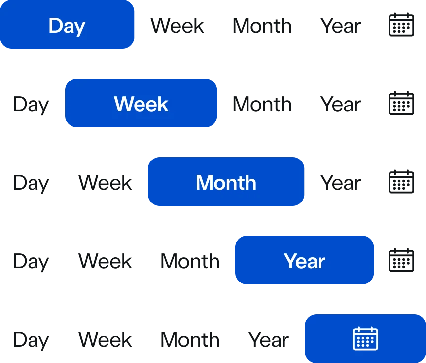
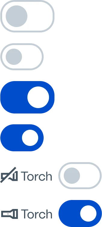
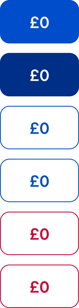
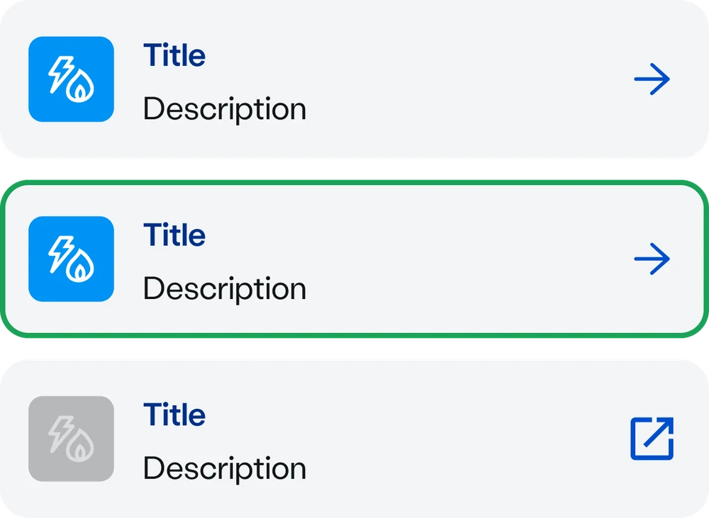
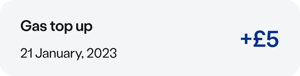
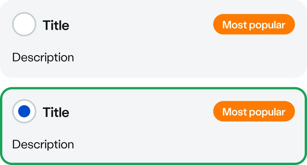
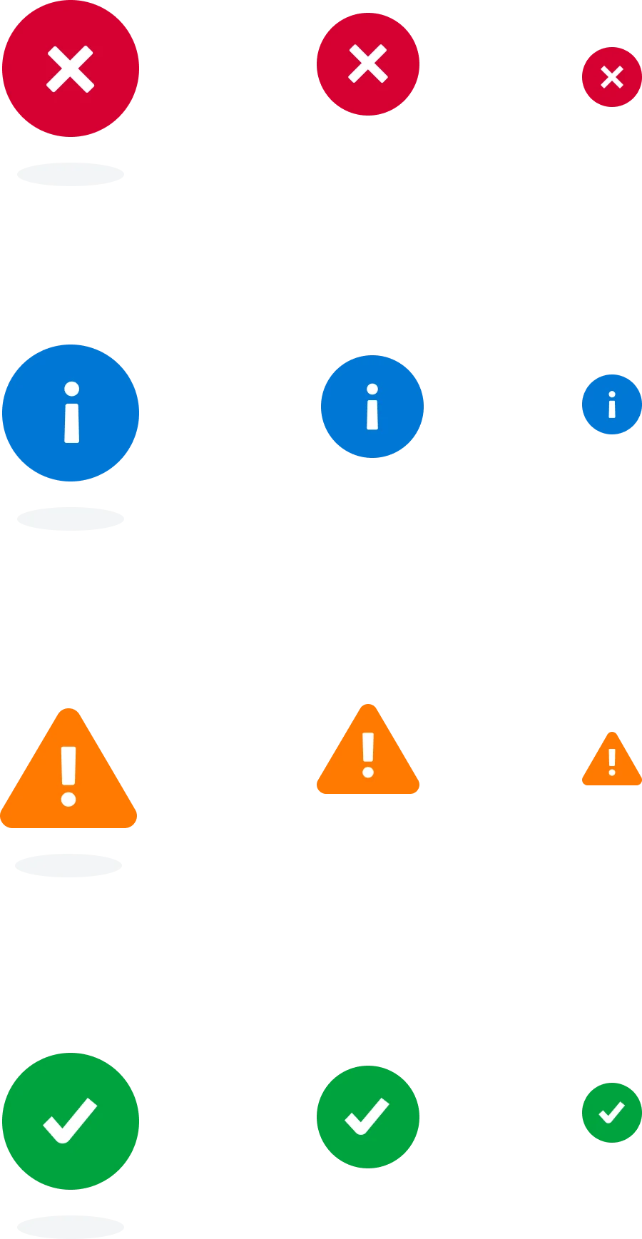
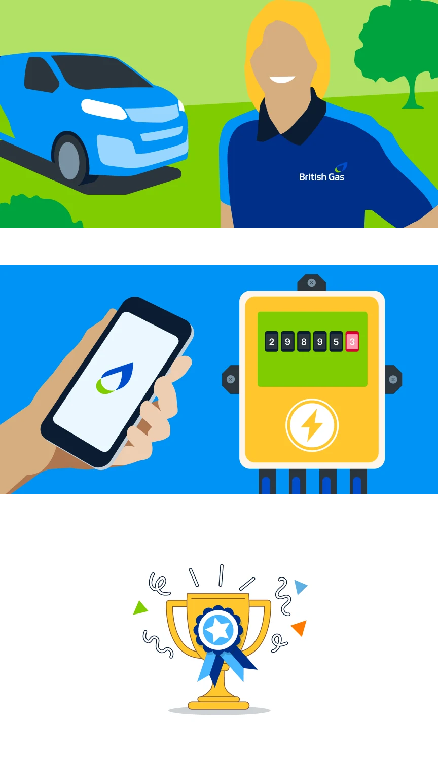
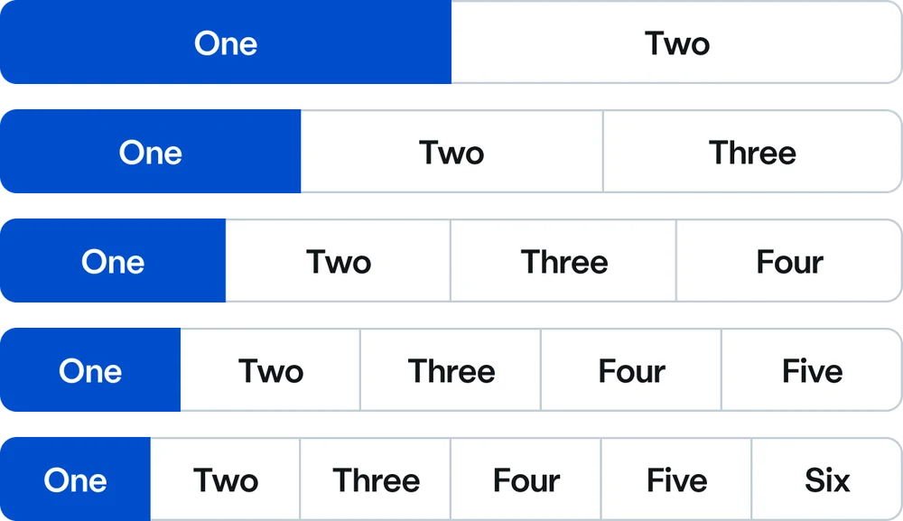
Each one in light and dark, with every state designed: selected and not, valid and in error, on and off.
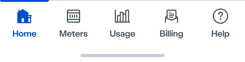
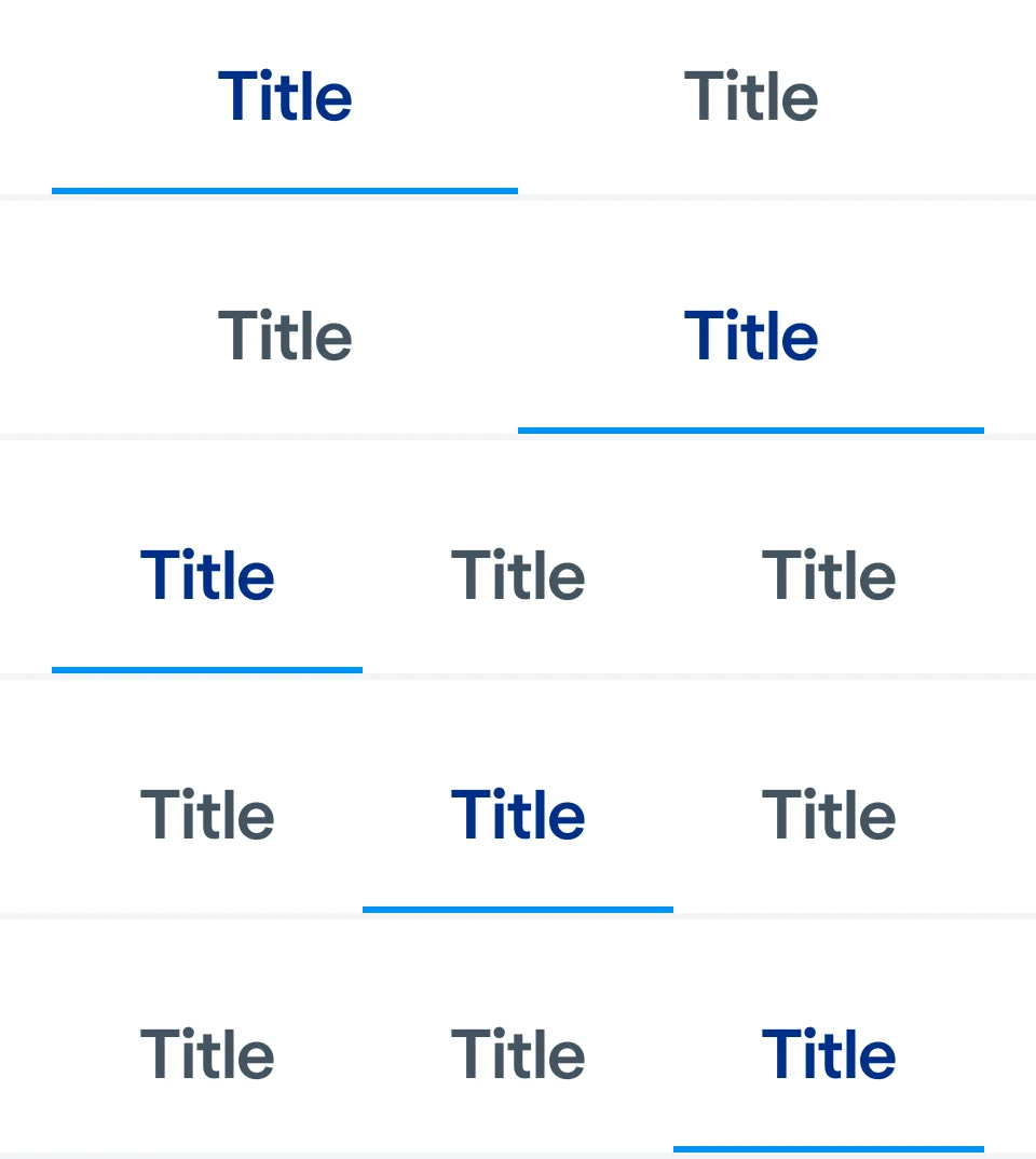
Tab bar · five sections
Date selector · day to year
Toggles
Amount chips · with errors
Account cards · default, selected, external
Transaction card
Radio cards
Status icons · three sizes
Illustrations
Segmented control · two to six
Payment methods
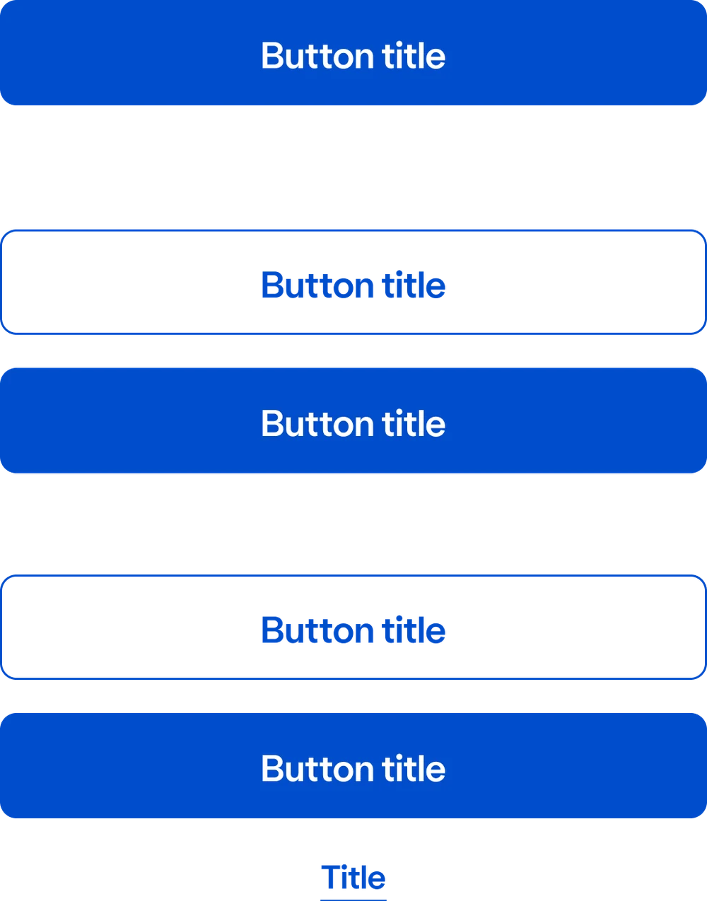
Buttons · grouped
Tabs
Wallet buttons · smart cards
How a colour reaches the screen
Three layers of tokens: a primitive holds the colour, a semantic token says what it's for, and the component uses that. Choose a part of the tab bar to trace it.
Primitive
Colours/
Semantic
Colours/
Component
Tab bar: icon active
A new theme only needs new values at the semantic layer, so a high-contrast mode would flow through every component.
Tokens, from Figma to code
Colour and type defined once as design tokens, and turned into the app's text styles, tests and Storybook stories.
Light and dark
Every component designed for both themes, from the same tokens.
Documented
A page per component: what it's for, its variants, and real examples of it in use.
Signed off
A tick on each component that design and engineering had agreed and built.
A way to contribute
How to create a journey, how to create a component, and how to hand it over to development.
Down to 320 pixels
Screens designed at the smallest common phone width, not just the newest phones.
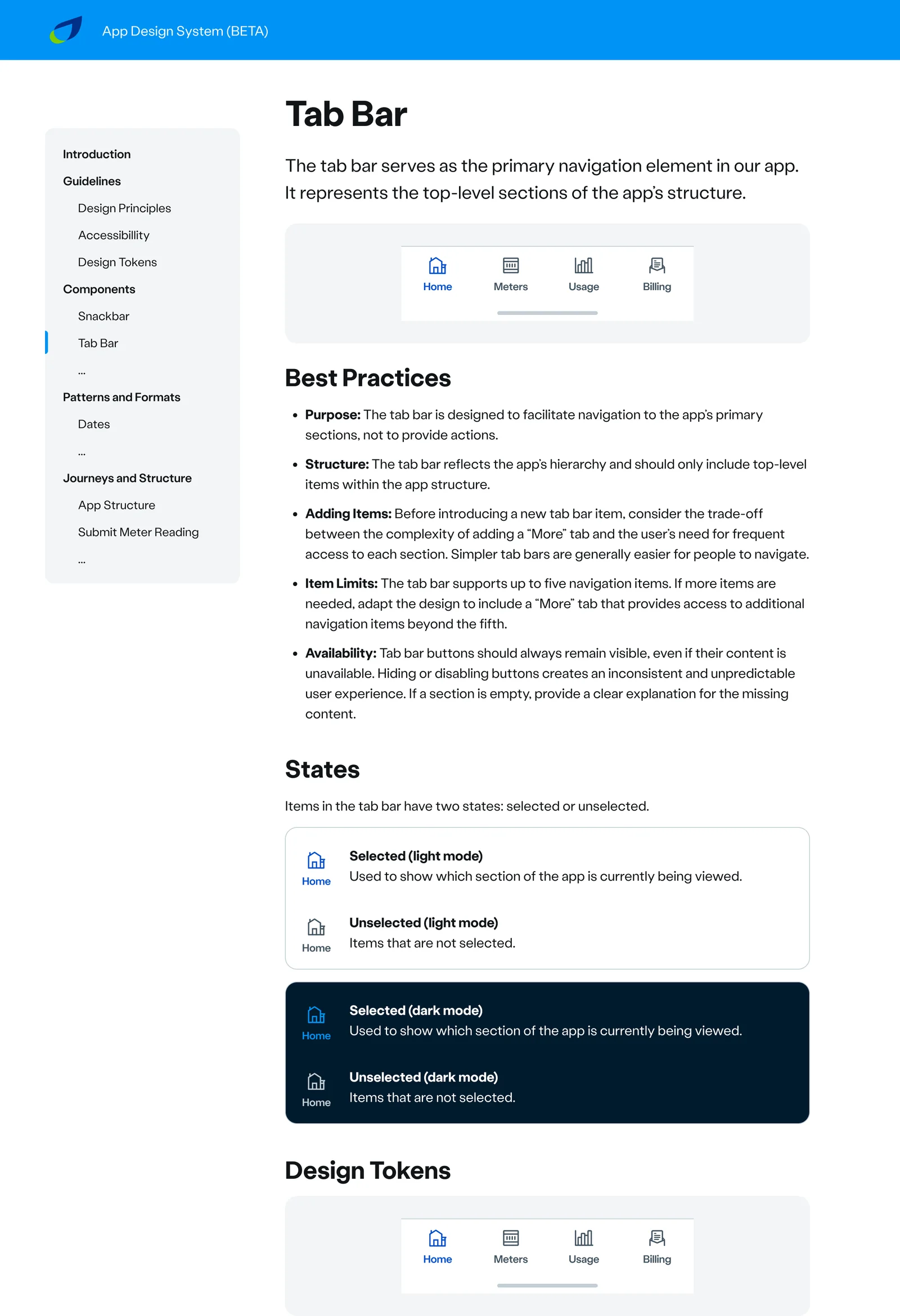
Documented: the tab bar's page, with when to use it, its limits and its states in both themes. 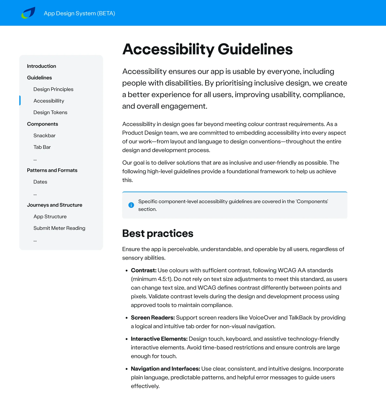
Accessibility guidelines, written into the system rather than left to each designer.
10/ Accessibility, from the start
British Gas customers span every age and ability. The accessibility approach set out who we were designing for, the standards we followed, and an honest status of where the app stood.
Visually impaired
Customers who rely on screen readers or magnification.
Hearing impaired
Customers who rely on captions and visual cues.
Motor impaired
Customers with limited dexterity, who may use other ways to interact.
Cognitively impaired
Customers who need simple language and screens that work the way they expect.
WCAG 2.1 AA
The benchmark for the app, as for the website.
Mobile best practice
Mobile-specific guidance on top of WCAG, for touch, small screens and changing font sizes.
An independent audit
The Digital Accessibility Centre audited the app in November 2022, and its findings shaped what came next.
Dark mode, and next high contrast
Dark mode shipped. A high-contrast mode would be next: the tokens only need one new role, and it flows through the whole app.
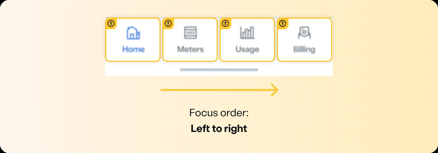
Focus order, specified for each component: the tab bar is read left to right. 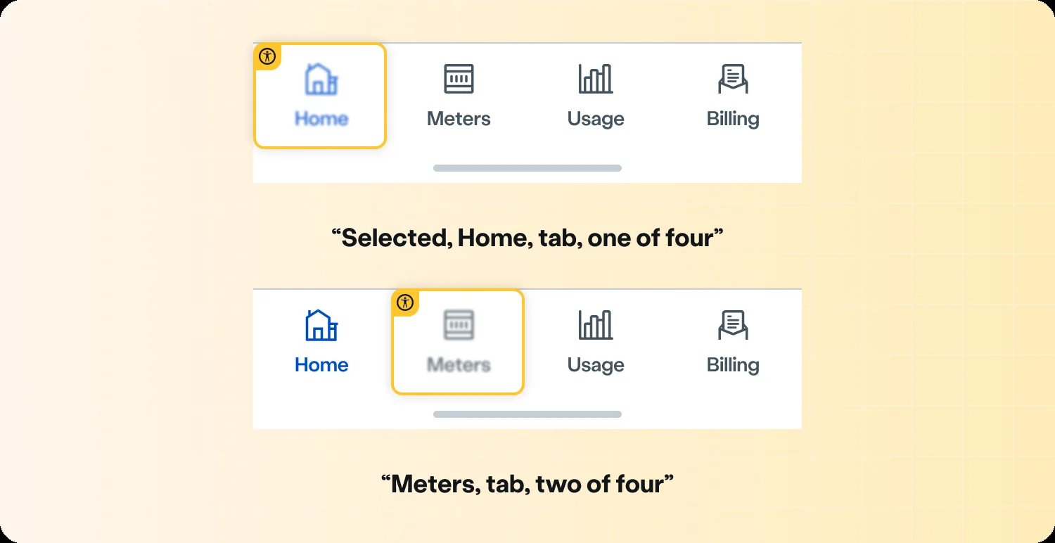
What VoiceOver should say, written down for engineering: “Selected, Home, tab, one of four.”
11/ Leading the team
One file of truth
Master designs organised the way the app is: shared screens first, then each way of paying, with an archive for what had changed. As lead designer for the app, I led a team of two designers across both sides of it, starting with a full audit of the existing app at the end of 2023.
Designed with engineering
Tokens, components and Storybook shared between design and code, and a clear handover for every new journey. We agreed component design, token naming and handover together in person, then built the system in Figma with tokens and variables, exported as JSON for the developers.
12/ Outcomes
- App Store, before2.1
- App Store, after4.5
And 4.1 stars on Google Play.
Reviews went up because the app was faster, more polished and cleaner, with more features, easier navigation and clearer wording.
What it delivered
Faster loading
From reworked code and performance work, with skeleton screens so nothing jumps.
A full design system
40+ documented components with tokens shared with engineering.
Dark mode
With every screen designed in light and dark.
One app, two experiences
For customers who pay by bill and customers who top up.
Every state designed
From loading and errors to emergency credit, in light and dark.
Accessibility built in
Against WCAG 2.1 AA, with an independent audit.
13/ More case studies
 Now readingBritish Gas appBritish Gas
 Next →Increasing RenewalsBritish Gas Business
Available from January 2027
Looking for a design leader?
I take on contract roles as a design consultant, head of design or fractional design lead, across product, service and design systems. Remote anywhere, or hybrid across the UK.