
— Deutsche Bank. One system, not many.
- A design system for Deutsche Bank Wealth Management.
- 117 components audited across 11 libraries and 5 live websites.
- A prioritised plan, a Figma strategy, and themes for retail and wealth.
- Client

The short version
A 30-second read
The problem
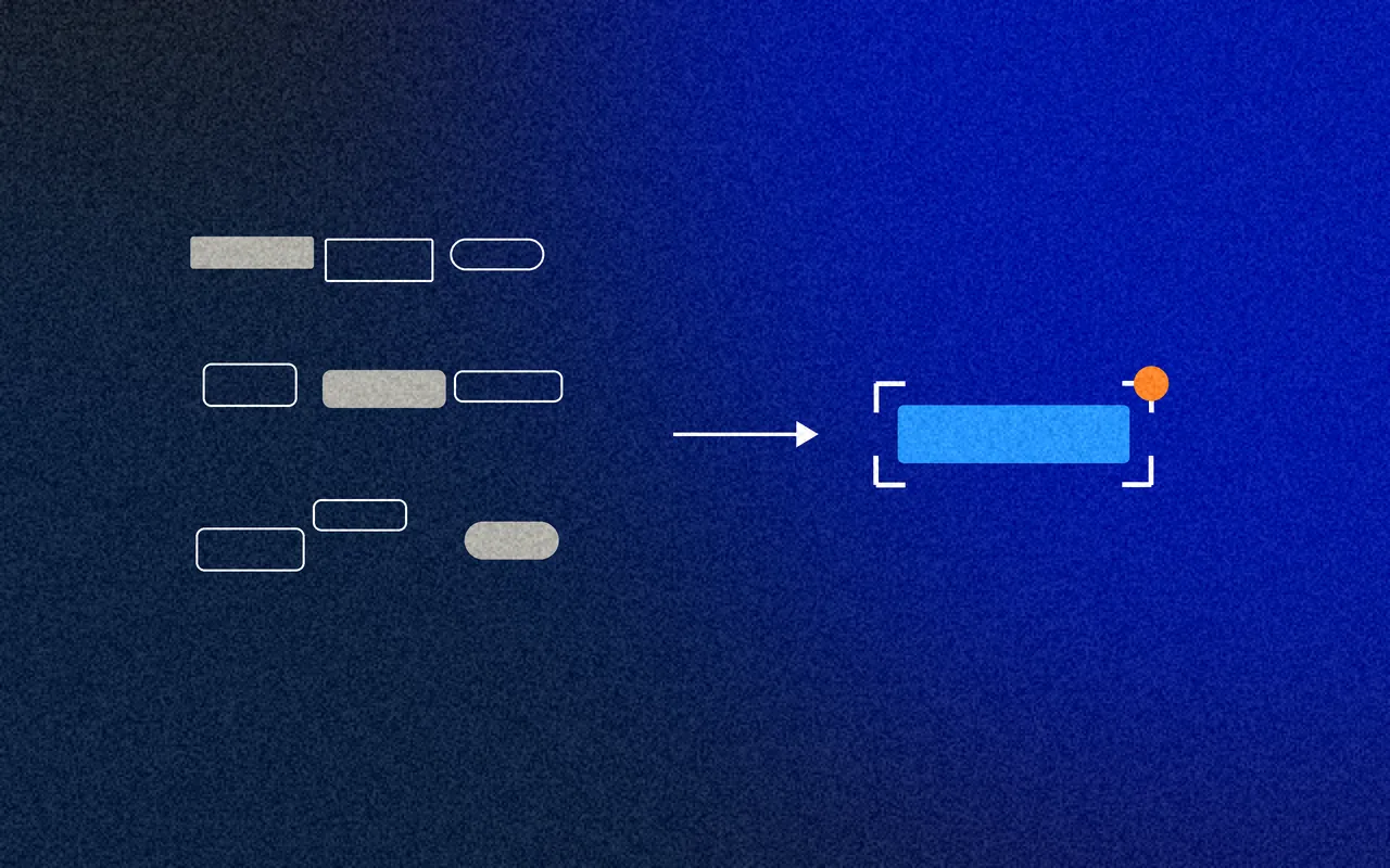
Local teams across Deutsche Bank Wealth Management kept designing and building the same components, from different libraries, for different countries.
What I did
I audited every component across the design libraries and live websites, ranked what to build first, and set the strategy for the design system in Figma.

What changed
A prioritised list of 80 components, starting with the 14 on every website, and a plan for one system serving both retail and wealth.
- 117components audited
- 11design libraries compared
- 14components on every website, built first
01/ Summary
- — Services
- Design system audit
- Component analysis
- Prioritisation
- Design system strategy
- Figma strategy
- Theming
- — Deliverables
- A review of every component across 11 design libraries
- A review of 5 live websites
- A prioritised build list of 80 components
- A Figma strategy: tokens, atoms, molecules, patterns, templates
- Retail and wealth explored as themes of one system
- Recommendations for the design system's first steps
- — Outcomes
- 117 components audited across 11 design libraries and 5 live websites
- 80 prioritised, starting with the 14 used on every website
- A Figma strategy: tokens, atoms, molecules, patterns and templates
- One system, many themes: the same components for retail and wealth
02/ Understanding the problem
- 117components audited
- 11design libraries compared
- 5live websites, across countries
- 80components prioritised
A bank of many parts
Deutsche Bank's Wealth Management design system was set up as a delivery accelerator for the whole bank: design and build digital assets once, and reuse them many times. Until then, local project teams had designed and built their own components, repeating effort and adding cost every time.
Where I came in
I was brought in for the first phase: analysis and strategy. What components exist, which matter most, and how should the system be set up in Figma so teams could start using it?
03/ Two views of the problem
Inconsistent experiences
Clients saw different designs from one country and channel to the next.
Many versions of one component
The same component designed and built again by different teams.
Siloed products
Products and services built separately, sharing little.
Off brand
Experiences that didn't follow the brand guidelines.
Not built for mobile
Pages that weren't optimised for mobile, or for search engines.
Below the bar
Below industry standards, and below what clients expected.
Repeated effort
Local project teams designed and built their own components, again and again.
Rising costs
Every repeat added cost, and the costs kept growing.
Slower to market
Without ready-to-use components, every new product started from scratch.
Unequal maturity
Teams in different places, on different tech stacks, with different ideas of what a design system is.
Brand left to interpretation
So every product looked a little different.
Few mobile-friendly pages
Little focus on responsive design.
Before designing a single component, find out how many versions of it already exist.
04/ The audit
How many buttons does one bank need?
I went through 11 design libraries, built over the years from four different sources, and listed every component in each. Then I checked 5 live websites, for Wealth Management and for Belgium, Spain, Italy and India.
57 of the 117 components existed in more than one library. The most common appeared in 8 of the 11.
- ButtonIn 8 of 11 libraries
- Text inputIn 8 of 11 libraries
- LabelIn 8 of 11 libraries
- IconsIn 8 of 11 libraries
- DropdownIn 7 of 11 libraries
- NavigationIn 6 of 11 libraries
05/ Prioritisation
Usage decides the order
Rather than design everything at once, I ranked components by how many live websites used them. The 14 on every site came first: build those once, and every site benefits.
- On every website14 components
- On 3 or 4 websites11 components
- On 1 or 2 websites41 components
- Will be needed14 components
First in line: on every website
06/ One system, two banks
Retail and Wealth Management had grown different looks. I explored whether the same components, a hero card, a global navigation and a content feed, could serve both through themes: a light UI and two dark ones.
Illustrative: the same components in three themes. Not real Deutsche Bank screens.
07/ What I recommended
Tokens first
It buys time: design kits and component libraries can follow on top.
FromEvery team choosing its own colours, type and spacingToA solid core of design tokens everyone can use from day oneAn engineer from the start
Even while the early work is tokens and design kits.
FromA design system treated as a design projectToEngineering in the conversation from day one, ready to contribute codeGuided, then self-service
Teams need the most help at the start. Plan for it.
FromTeams relying on the design system team for everythingToA public plan to move from fully guided to self-serviceOne language
With examples, until it's how everyone talks.
FromThe same thing called different names by different teamsToThe atomic model, shared: atoms, molecules, organisms, templates, pagesMeasure and celebrate
Build the business's confidence that the system is a force for good.
FromEvery team treated the sameToEach team benchmarked, and the first success shouted about
08/ A strategy for Figma
Built in layers
Tokens for colour, type, spacing and motion, carrying each brand. Then atoms, molecules (components), organisms (patterns) and templates, following the atomic model the whole bank would share.
Documented where it's used
Component documentation with when to use each one, do's and don'ts, accessibility guidelines and use cases, in the design files themselves, so designers don't have to go looking.
09/ Outcomes
What it delivered
117 components
Audited across 11 design libraries and 5 live websites.
80 prioritised
Starting with the 14 used on every website.
A Figma strategy
Tokens, atoms, molecules, patterns and templates.
One system, many themes
The same components for retail and wealth.
Next
The prioritised components designed and built, starting with those on every website.
Available from January 2027
Looking for a design leader?
I take on contract roles as a design consultant, head of design or fractional design lead, across product, service and design systems. Remote anywhere, or hybrid across the UK.